Forecasting the Coming Housing Collapse
Home prices have, yet again, been recklessly pumped up by the Fed's own "easy money" monetary policy leading to an even larger disconnect from fundamentals and likely a major home price downturn.
As the Fed’s rate tightening policy regime continues to put upward pressure on mortgage interest rates and the steadily worsening recessionary trends (and other notable economic headwinds) mount for the macro-economy, it’s becoming pretty obvious that the nation’s residential housing markets are in for a serious pullback.
The most important questions for the housing market now are when will we see the peak firmly established for home prices this cycle and what will be the pace and scale of the downturn?
I’ve developed a model to attempt to answer those questions using past trends as a general guide as well as a healthy dose of pure conjecture based on my first-hand experiences with our most recent past two housing downturns.
First, I want to note that while my outlook would probably be considered by many to be highly pessimistic, I had an equally pessimistic outlook for housing back in 2006 and, looking back on my posts from those years preceding the Great Recession, I think my take back then was actually spot inline or even a tad too optimistic for the times that were headed our way.
In general, my key principles for the dynamics of highly speculative and delusional markets and asset classes could be stated simply as “What goes up, must come down” as the bubble inflates and then, once the delusion has broken, the sentiment shifts to “The bigger they come, the harder they fall.”
In other words, speculative trends tend to overshoot, first on the up-side and then on the down but over long term, the primary function is ultimately a reversion to the mean. In some cases, the “mean” might just be the zero-bound but in a fundamental asset class like housing; over the long haul, the trend should be a slow and steady (and far from exciting) random walk up and to the right, keeping up with inflation but no more and no less.
As for the current moment, we are sitting at the nexus of a number of Fed induced “easy money” speculative delusions in the era of the “Everything Bubble”; Stocks, housing and alternative investments (cryptos, NFTs, SPACs, etc.) had all been (until recently) running white hot for at least the last two years while stocks and housing have been propped up and pumped full by ZIRP and QE policy for over the last thirteen years.
This makes comparing the current period for the housing market (or any other asset class for that matter) to past periods very difficult given that so much of the general economic activity that has surrounded us since 2008/09 is but a Fed induced fiction and we will never truly know what the fundamental trends would have looked like without all the market manipulation.
But, be that as it may, I have modeled out the trends using a simple quantitative approach that mirrors my “key principles” whereby I relate the size and scale of the boom to the extent of the bust and also, relate our current cycle to the past two cycles.
First, take a look at Robert Shiller’s long running nominal home price index (blue left axis) plotted with the year-over-year percent change (red right axis) monthly since 1953. Note that this index is synthesized from several source indices as the S&P CoreLogic Case-Shiller only runs back to the 1980s.
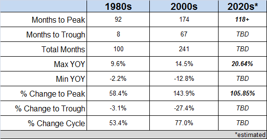
Notice that the scope and scale of each housing bubble since 1980s has been growing with each successive cycle. Below is a table summarizing the 1980s, 2000s and the current 2020s cycle details:
Notice that the year-over-year (YOY) percent change for each cycle has been increasing by about a factor of 1.5 for each subsequent cycle. While I don’t believe that this is some sort of magic factor, I’m going to take this as a general indicator that the current boom has just about reached is maximum upward thrust while also giving a sense of the scale of the minimum YOY when the downturn eventually kicks into gear.
Next, look at the chart below displaying the S&P CoreLogic Case-Shiller Home Price Index of the late 1980s era “Savings & Loan Crisis” boom bust cycle (a subset and not the full cycle) and notice that I have highlighted both the strongest monthly of year-over-year percent change (bright red bar at 2/1987) and the strongest monthly month-to-month percent change (bright green bar at 6/1987) as well as the weakest of both (most negative YOY percent change at 4/1991 and MTM at 11/1990).
Let’s recall that while the Savings & Loan Crisis was a major event, the boom and bust primarily affected key cities of the east and west coast and their associated suburban property markets and did NOT generally express itself across the whole of the U.S. like the following “Great Housing Bubble” cycle ultimately did a decade later.
Since my plot is displaying the “National” S&P CoreLogic Case-Shiller Home Price Index and given that this home price boom and bust was largely regional, the cycle appears subdued by comparison to more recent cycles.
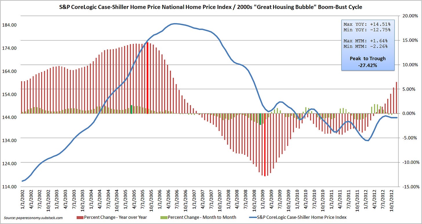
Next, look at the chart below displaying the S&P CoreLogic Case-Shiller Home Price Index of “Great Housing Bubble” boom bust cycle (a subset and not the full cycle) and notice again that I have highlighted both the strongest and weakest monthly YOY and MTM gains and losses.
Clearly, the “Great Housing Bubble” ran much longer, reached a much higher level and ultimately collapsed much harder than past cycles. Remarkably, it took about 174 months to reach the peak and another 67 months to trough with a whopping 143% peak increase which was eventually reduced to a net 77% increase after a 27% decline during the bust.
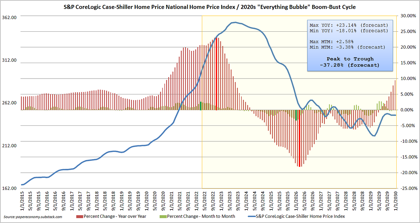
Finally, look at the chart below which displaying the S&P CoreLogic Case-Shiller Home Price Index of “Everything Bubble” boom bust cycle (a subset and not the full cycle) with a projected price trend (all data within the yellow band) running all the way to 2030.
My forecast for the price trend going forward is pretty simple and involves the following key assumptions:
1. The Month-to-Month (MTM) percent change of 2.58% seen in March of 2022 will be the largest monthly increase we will see for this cycle given that the S&P CoreLogic Case-Shiller is a three month moving average and will now (going forward) start to capture price dynamics reflecting the increasing mortgage interest rates that began to surge in earnest during March.
2. We are very near the maximum Year-on-Year (YOY) percent change which I estimate will reach about 1.5x the maximum YOY percent change seen in the last cycle (14.5%) at 21-23% and will come later this year at which point all subsequent monthly YOY reads will trend continuously lower till they ultimately turn negative into the depth of the decline.
3. The general downtrend in prices will play out similarly to the “Great Housing Bubble” cycle with the exception that the monthly declines will be a bit more intense given the more aggressive price run-up and the abrupt reversal in mortgage rates.
I will continue to update this projection as new S&P CoreLogic Case-Shiller data settles as well as revise my overall thesis and key assumptions but at the moment it appears to me that the strongest monthly MTM change was seen in March, we are closing in on the largest annual YOY change coming likely this November and that the peak in prices will probably be some time next year based primarily on the effects that increasing mortgage rates have on market activity.


Nice piece, thanks for sharing.
I would suggest the possibility that prices fall at an accelerated rate (not necessarily lower trough, but getting there faster) due to the change in psychology of the general public. In the years leading up to the peak in prices in 2007, and well after, the public was inundated with a never ending tsunami of propaganda that 'Home prices never go down!'. Anyone selling a house during this time heard the same thing from all corners of the industry, not to mention the media. This psychological backdrop simply no longer exists. In a world where the whole population knows darn well that home prices can go down, there will be much more active competition to sell once it becomes obvious in a given area that prices have started to drop. Very interested to see how this develops.